
Loading page
All work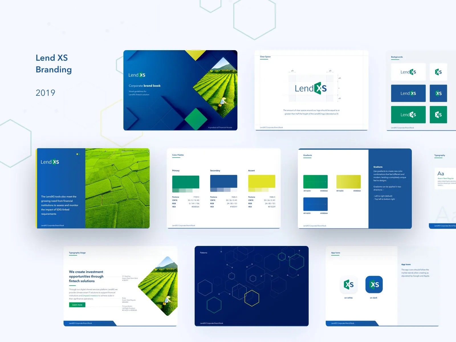
Pick a screen to zoom in · ← → to step through · Esc to reset
16 · Brand system · Earlier work
Fintech SaaS brand book
This identity gives a fintech SaaS product a visual language that can carry from its brand book into web and application surfaces.
The system defines logo use, typography and a green, blue and yellow palette with specifications for both print and digital work. Named gradients, a hexagon pattern and diamond-shaped image crops provide additional structure, with examples showing how the identity extends to business cards, illustration and app icons.
A palette with a job
Primary green, secondary blue and an accent yellow are each specified in Pantone, CMYK, RGB and hex, then combined into named gradients with set directions.
The hexagon pattern and diamond image crop give the brand a recognisable shape, carried through to the app icons and the landing page.